Colour-blindness and User Experience
When surfing the internet, can you distinguish green or blue on interfaces? Or are you part of the 4.5% of the population that are colour-blind? When designing interfaces, many designers tend to forget that 4.5% part of the population and do not include them as users into their designing process. But designing for colour-blind people can benefit both the product and the general audience.
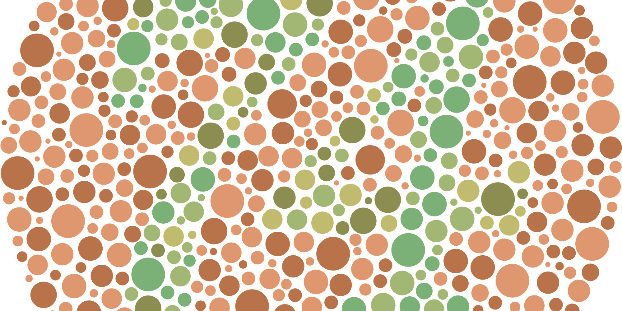
Colour-blindness can come in several forms but its main consequences are: not being able to see colours clearly, interpreting one colour in exchange for another, and not being able to distinguish specific colours. It affects 1 in 12 men and 1 in 200 women worldwide.
Whether it is to attract customers or as a way to embellish a product, color has always been a powerful tool in the design world. The interface of a website is what users see first, so keeping the focus on colour-blindness in mind, how can we ensure that the user experience (UX) of a product will appeal to all users equally? And why does it matter?
In this post, you will get a better understanding of the benefits of adapting your UX to colour-blind people and how to achieve it.
Advantages of a UX mindful of colour-blindness
One of the main benefits of having a colour-blindness aware UX is that it contributes towards your product’s accessibility for all users and therefore your product’s marketability. Accessibility in general widens the usability of products for people who experience disabilities. Not only does considering colour-blind users show that you have thoroughly developed your product’s interface.
Designing for colour-blind people is a real challenge because you never exactly know what colours people are going to be able to see or not, and you are never really sure what percentage of your users they are representing. But that is what makes the challenge interesting, because keeping issues they might encounter in mind helps you solve many of them in advance. This makes your website look more professional, and accessible websites are more likely to be ranked well by search engines.
Of course, it is impossible to create a website that meets the needs of every single user but designing an accessible website helps with the prioritisation of its content. Looking at your website with the aim to make it accessible to anyone is a good way to notice what content is important and what is not. According to Jeanne Liu from Usability.gov, any content that a user would have to look at for over 3 seconds should be made more differentiable. It is also going to help them distinguish the content from navigation bar/buttons and therefore what should be done to show them differently on the interface. For example, what actions should be prioritized on the website, what content should be put on top of the page instead of having it at the bottom of it, and so on.
As we said earlier regarding accessibility, improving a website for people affected by colour-blindness can not only make it friendly for color-blind people but also for anyone with vision issues. Factoring in these issues not only improves the experience generally, but also ensures that you will reach more of your desired audience.
So now that we know that we can benefit from a colour-blindness and accessibility focused UX, how do we implement it into a product?
Ways to make the User Experience more accessible
There are several ways to turn the UX of your product into something accessible to everyone particularly to people who are colour-blind. Here are a few to help you:
– Add symbols: Instead of focusing on adding words in colours or coloured boxes to indicate an action, think about adding a symbol next to the word, especially when the user’s attention is required. For example: use alert symbols next to important messages, add a ↑ at the bottom of your website to scroll up the page, or use symbols such as < or > next to words such as previous, next, continue, read more, etcetera. Used along with colours, symbols can appear more important than solely text and make it easier for colour-blind users to access a website and its content. Consider how important symbols are in navigating an airport or other public buildings, or in general in transportation.
– Use patterns: Patterns can help to show colour contrast. By adding them to your design, it can help users recognise different colours more easily and still give appeal to your interface. Especially when showing graphs, the use of patterns along with colours makes it easier to interpret the results.
– Use smart colour combinations: Some colour combinations such as blue-purple, green-brown, green-red and blue-green are hard to distinguish for colour-blind users. It is then important to use smart colour combinations that are favorable to everyone.
– Test on all users: Doubtless, you know how important user testing is when working on user experiences. But, including some colour-blind users into the process if you can recruit them can help highlight issues with the interface that people without colour blindness would not have noticed when testing a product. If you cannot test on colour-blind users, keep the various factors that can be found in more in-dept writing available about colour-blindness in mind during the testing process as if a colour-blind user were to use the product.
Summary
You might already have applied some of those tips to your website, but to go further and check whether your product is appropriate to colour-blind people or not, some great tools online are available to help you. Use the coblis simulator, for example: http://www.color-blindness.com/coblis-color-blindness-simulator/.
And for more information on how we can help with user testing in situ or remotely get in touch to discuss an appropriate testing process for your product.