Making visionär.design More Accessible
As user experience is key for Visionär, we have decided to take a step forward in making our services and designs accessible to all. The current Visionär website was created a few years ago to echo our values and share our care for clients. That said, it needed to be updated to be available to all. Yes, we’re talking about accessibility, i.e. making a product that can be used by people with disabilities.
We decided to try and comply with the WCAG, the Web Content Accessibility Guidelines: (a lot of) standards created to motivate us all to think of the web differently and to create more inclusive experiences from the early stages of development (see [What’s new with WCAG 2.1]).
First steps
We used the product Achecker on all pages of the Visionär website to highlight the problems linked to HTML and CSS: this is the first step to a better-structured site, as you will see below. Achecker can detect the potential problems thanks to its implemented rules.
Here is an example of how it works and the kinds of outputs it produces:
Check 178
“Error: ‘Alt text does not convey the same information as the image.'”
Achecker reads the name of the image and looks to see if the alt-text contains the same information.
“FAIL: src=’owl.jpg’ alt=’a brown dog’
PASS: src=’owl.jpg’ alt=’a giant owl'”
Achecker is smart, but not always accurate: this file may be an image of a dinosaur, no matter what its name is, which is why a human needs to verify the information.
We reviewed these automated checks and kept the most relevant ones by looking at the website and its code. Achecker detected about 200 potential problems on each of our pages, some of them making no sense in our case (“Check 270: Unicode right-to-left marks or left-to-right marks may be required”), and the others that we carefully appointed were mainly about the structure and defining elements.
Why are all of these details about the code important?
When you use a webpage, you don’t see the components that are behind it. People with disabilities may use screen readers and other devices that use the webpage code to function. These “assistive technologies” see how the webpage is constructed and apply what they find to make the page accessible to people with disabilities.
If a website didn’t take that it’s available to assistive technologies into account when written, it may not be compatible with these devices and therefore not accessible to people with disabilities. Alt text, for instance, that we’ve just seen above, is a way to present images to people with low-vision by reading what an image or another element is about. This attribute, however, shouldn’t be used to describe solely decorative images that could interfere with the use of the webpage.
In the end, there are a lot of things to think about regarding the website structure, and we learned a lot in the process.
Other elements
All of these HTML elements to implement or modify gave us, in a way, the theoretical part.
For a better understanding of what these elements are for, we decided to move on to some more practical things:
- Keyboard compatibility: we used the website with the Tab key and the Enter key to observe how the site behaves.
- Screen readers: we tried to use the website with two screen readers, ChromeVox and NVDA. We found out how these tools use the HTML structure. Menu elements (“Home, Our work, Success Story…) for instance that are written as an HTML list in the code are presented as a list. The first element, the home button, is described as follows: “list of seven elements. Home.” This way, people with low-vision can understand how the page is organised. This aspect is, for us, something we haven’t thought about, and it changes our perspective on both web pages and accessibility in general.
The following video shows how the website behaved when we first ran it through ChromeVox. It provided a lot to think about!
Colourblindness
Another more practical element we looked at was the website palette. We used Oracle to see the website as colourblind people would see it.
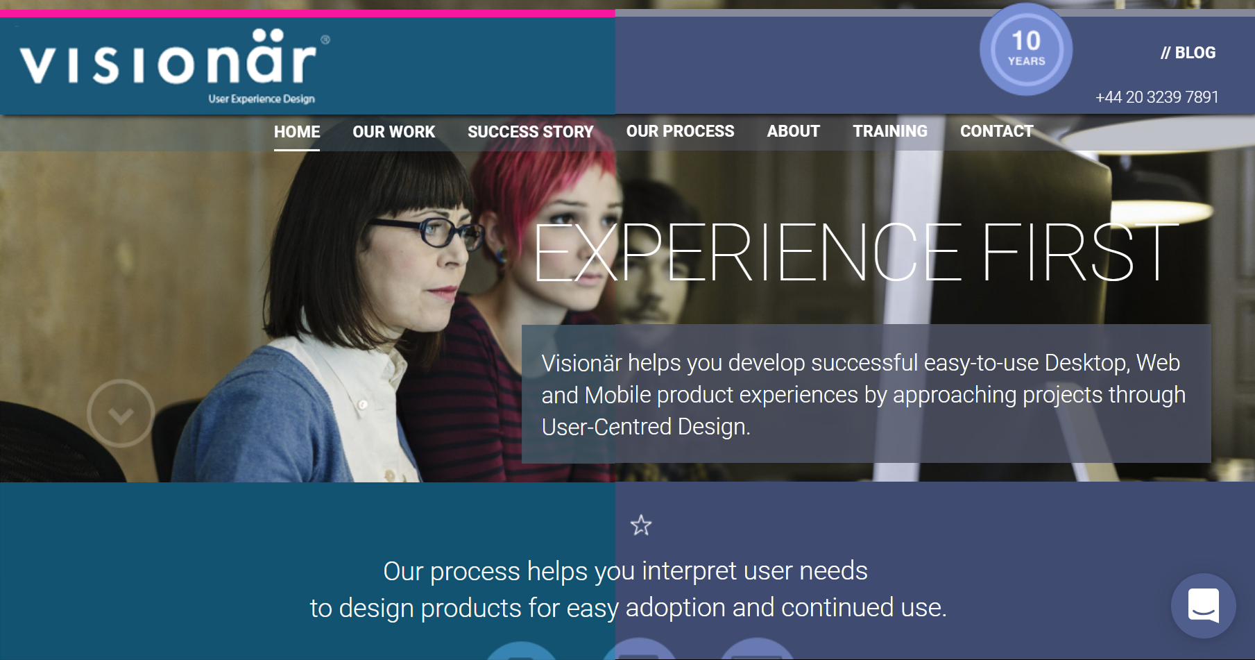
On the left: the main page as we at Visionär see it. On the right: the main page that people with deuteranopia see (deuteranopia is one of the most common forms of colourblindness).

The website seemed usable for people with all forms of colourblindness, though, did highlight a certain lack of contrast in some areas. We’ll have to dig into this.
Conclusions
Thanks to the tools mentioned above as well as others, we now have a list of elements to change in the HTML code and many ideas of things we would like to improve. Most of the work involved looking for information about needs and accessibility, as our goal was not only to develop the website but to understand why some things would improve it.
What would be the best way to make a website accessible?
The best approach is to think about accessibility from the beginning. That way, your website is more inclusive from the first day, and you won’t have to implement a lot of changes over time. We would advise you to do it before reusing your website structure for other purposes (a version of the website in another language, as is our case) so that you only have to do it once.
Achecker, Metachecker, ChromeVox and other tools have proven to be useful, and the W3C webpage gives a lot of information on how to deal with the problems found and why they are essential.
*
With the participation of five T2M (Multimedia translation) MA students, Université Bourgogne (University of Burgundy), Dijon:
Amandine Jacobi, Juliette Dijoux, Lorraine Heffernan, Cynthia Poullain, Marion Carpentier.


